Showlaa
A series of neat and fluid graphics
Showlaa Project
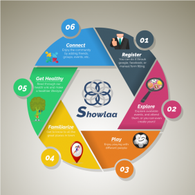
For the logo, I wanted to present audience visually with the idea of interconnectedness. And, that means, you're sort of representing the architecture of the universe. The nexus of this reality runs on series of frequencies that are each inherently connected in one way or another. Coming to that, I used the architecture of the universe, sacred geometry, to design the logo, and it turned out great! I loved it.
The second graphic content is an inforgraphic. We wanted a direct and simple way to represent end users on how they can achieve the functionality of the system. To me, it's quite vivid ;).


